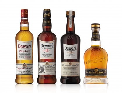
New Dewar’s Look
(Credit: Dewar’s)
Dewar’s, the world’s most awarded blended Scotch whisky, today announced the launch of its exciting new visual identity and bottle design. This major evolution in the storied Scotch founded by John Dewar in 1846 is being supported by a global multimedia campaign rooted in the brand’s authenticity and legendary heritage to take the iconic brand into the future.
All brand activity moving forward will be under the banner of “True Scotch Since 1846” – capturing Dewar’s status as the definitive blended Scotch whisky, distinguished by its peerless provenance, quality and craft.
To celebrate True Scotch, the core brand range will be adorned in new packaging that brings to life Dewar’s remarkable heritage, enabling consumers to hold a piece of the Dewar’s story in their hands every time they pick up a bottle.
“We are immensely proud of Dewar’s heritage, and the quality and skill that it has embodied for the past 168 years. True Scotch, coupled with the new design, is our way to connect with the past, while embarking on an exhilarating journey into the future,” says John Burke, Global Category Director for Dewar’s. “Our new marketing campaign tells the story of the brand and the exquisite liquid in a real and tangible way, giving every consumer the opportunity to connect with Dewar’s history.”
The Dewar’s new look and feel begins with a distinctive shape for each bottle in the range. Excellence is expressed in every aspect – from the bold colors, stoppers and seals, to presentation boxes, labeling, bespoke typefaces and product information – all inspired and sourced from the extensive brand archive in Scotland. The labels on the new Dewar’s bottles incorporate a wealth of special features to help consumers discover the stories behind the Scotch whisky. In addition, all Dewar’s premium and super-premium whiskies carry individual statements of aging and provenance. As a nod to its heritage and exceptional craft, each bottle of Dewar’s Signature comes with the unique certificate of authenticity, signed by the Master Blender.
The most distinctive feature of the new Dewar’s look is the trefoil Celtic truth knot that has been embossed onto the glass of every bottle. A powerful visual representation of Dewar’s strength and longevity shows three interlocking ‘D’s that represent the three men of substance who created the company that endures to this day – John Dewar and his sons, John Alexander Dewar and Tommy Dewar. The design is intended to embody Tommy Dewar’s famous and widely quoted maxim that “the quality of the article should be its greatest advertisement.”
The new Dewar’s visual identity will launch this month in the United Kingdom, Spain and Greece, followed by all other markets, including the United States, Global Travel Retail, Russia, India and Lebanon. It will be incorporated into all point-of-sale and merchandising assets, to strengthen the impact and differentiation of the brand range.
